Brand Guidelines
This guide defines the visual language, design style, and principles that shape a clear and consistent brand experience, no matter the team or area of expertise.
Whether you're designing for digital platforms or printed materials, these guidelines are here to help ensure every touchpoint helps reinforce an impression of efficiency, clarity and excellence.
01
Mission
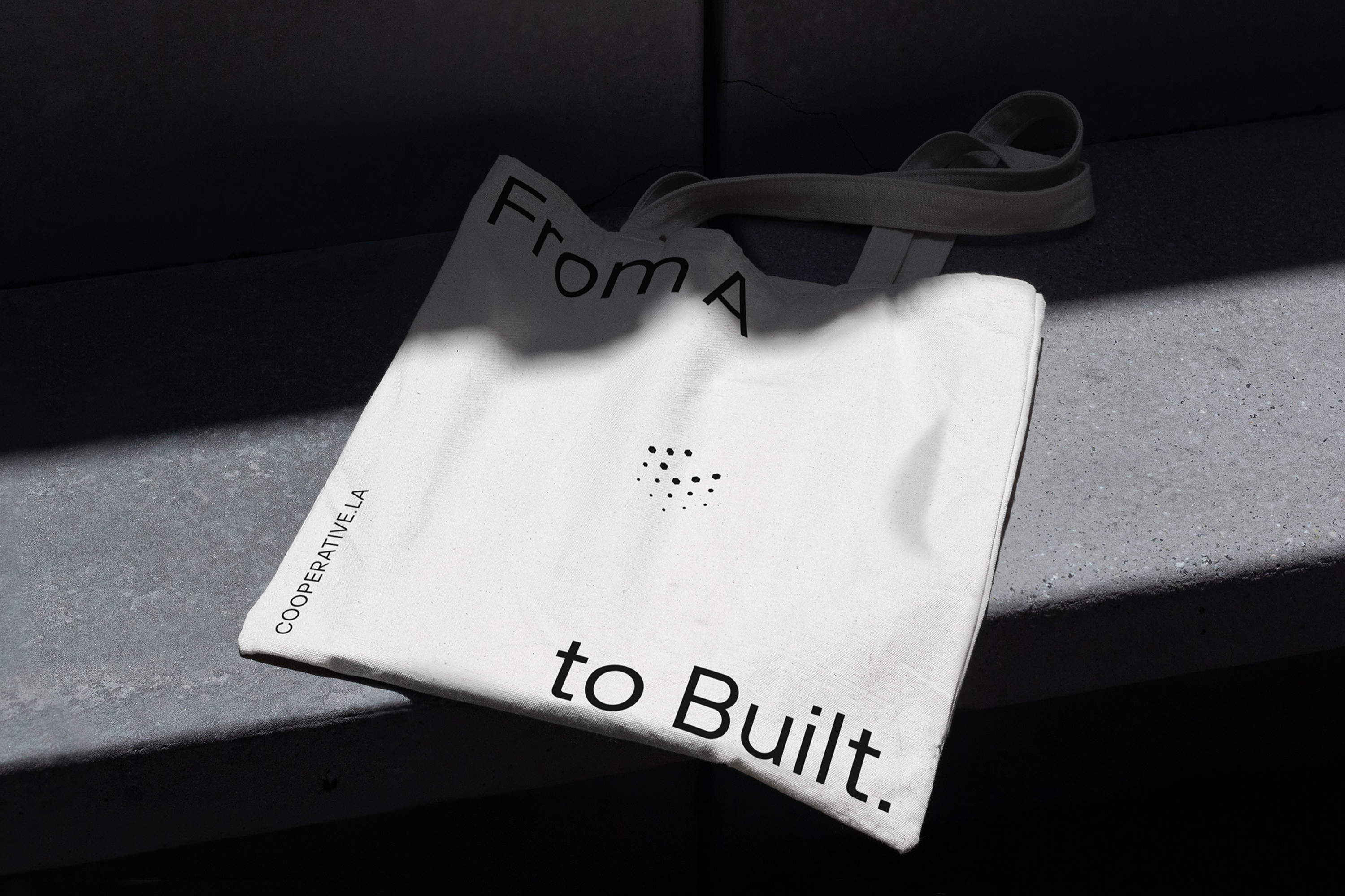
From A to Built with efficiency, clarity and excellence.
At Cooperative LA, we’re redefining the standard of owner’s representation and project management firms. That’s from the way we communicate, to the way we treat every project as if it were our own.
With integrity, purpose and precision on every project, we’re committed to delivering results that stand the test of time –fostering relationships, driving innovation and bringing maximum value at every stage.
Working with Cooperative LA guarantees positive results.
02
Vision
Disrupt the industry with ideas, action, and insight.
As well as becoming the most sought-after owner’s representation and project management firm in Los Angeles – and beyond! – we’ll shift industry norms from reactive to proactive, ambiguous to transparent, corners cut to corners well-built.
Setting a new standard for our industry, we’ll push boundaries, embrace disruption, and focus on sustainable growth to ensure smarter, safer and more resilient eco-systems – no matter where we’re based.
03
Values
Our values underpin everything we do. We keep these in mind when creating communications and new content.
Prosperity throughout.
Ensuring long-term value and sustainable solutions for clients and communities.
Progress, always.
An overlooked charge or a simple accounting mistake shouldn’t throw off your financial plans. We step in to identify and correct these issues before they become bigger problems.
People focused.
Valuing honesty, fairness and respect to build trusted, lasting relationships.
Project first.
Prioritizing success over ego to ensure every decision benefits the project.
04
Tone of voice
Our tone of voice determines the things we say and the way we say them, in any form of communication. We split tone and voice into two distinct areas.
Voice:
Your voice doesn’t change, it’s always the same. It might get louder or quieter depending on the situation, but you don’t suddenly sound like someone else. The voice of our organisation is exactly the same, we always want to sound as if communications are coming from one person – the collective voice of our brand.
Tone:
Imagine tone as dials we can turn up and down. When we’re talking, we mix these levels depending on the situation – you don’t speak to a colleague the same way you speak to your dog. So tone is very much determined by who we’re speaking to, when, where and what we’re trying to get across. The most important thing to consider here is that we’re trying to communicate as one, 360 degree, familiar voice – like a person would.
Voice
At Cooperative LA, we always sound:
Professional. But not corporate.
As an organization, we know our stuff. We’re a group of people who are qualified, experienced and knowledgeable in our field – so we should always sound like experts. This should never tip over into unemotional, over-done, salesy language so often used by professional organizations.
Confident. But not arrogant.
Trust is key. And building that trust means coming across as assured, composed, relaxed and tenacious. There’s a fine line between bold and boastful, ambitious and conceited, determined and self-important. Let’s make sure we steer clear of all the latter!
Human. But not over-familiar.
It’s essential that we come across as real people, doing real work in the real world. After all, it’s one of our USPs! We should always sound open and honest, genuine and understanding, candid and down-to-earth. Although it’s important to seem friendly, we’re not really friends with the reader. So let’s not use language that’s overly pally, twee, or cozy.
Tone
These dials should be fine tuned to suit the situation:
Enthusiastic. But not naive.
We really do care about what we do. It’s often appropriate to get that enthusiasm across with a tone that’s full of optimism, passion, and energy. It’s not appropriate, however, to use this too often and too liberally – otherwise we risk sounding gushy and excessive, intense and full-on, or innocent and green.
Thoughtful. But not philosophical.
We’re always thinking ahead, coming up with valuable ideas, and actively solving problems. So it’s right that we should sometimes turn up that tone dial – using language that’s deliberate, reflective and analytical.
If over-used, this can come off as scholarly and deep – turning off our desired audience. Let’s use it more in thought-pieces and when we’re discussing things like our process.
Witty. But not jocular.
We have fun at work, and we’re all fun people! We want this side of our personality to shine in the right way. At times, it makes sense to use witty, bright, upbeat language that gets across our lively nature.
This sort of language shouldn’t be used in a way that comes off as silly or cheeky, sarcastic or flippant, facetious or glib. Be original and clever!
05
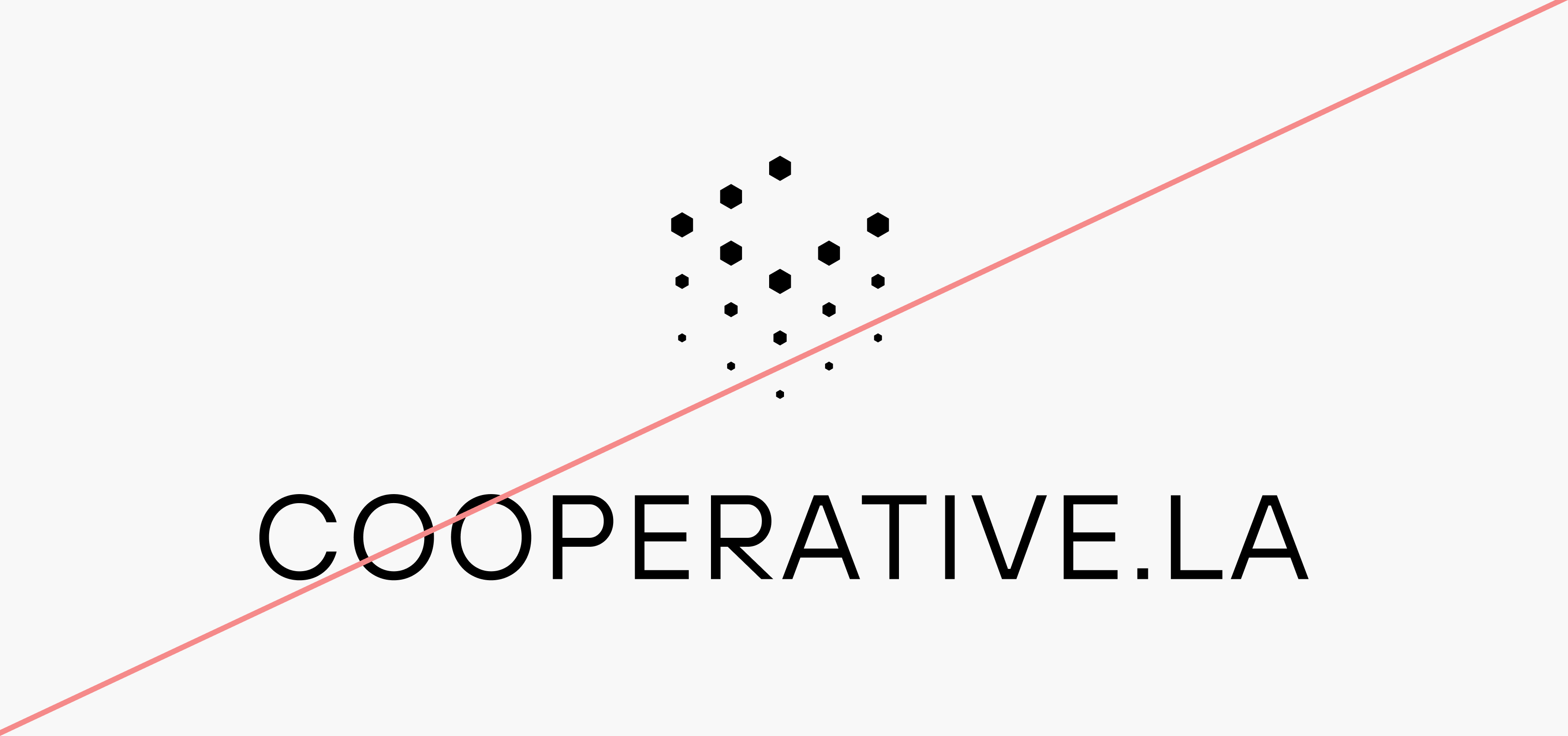
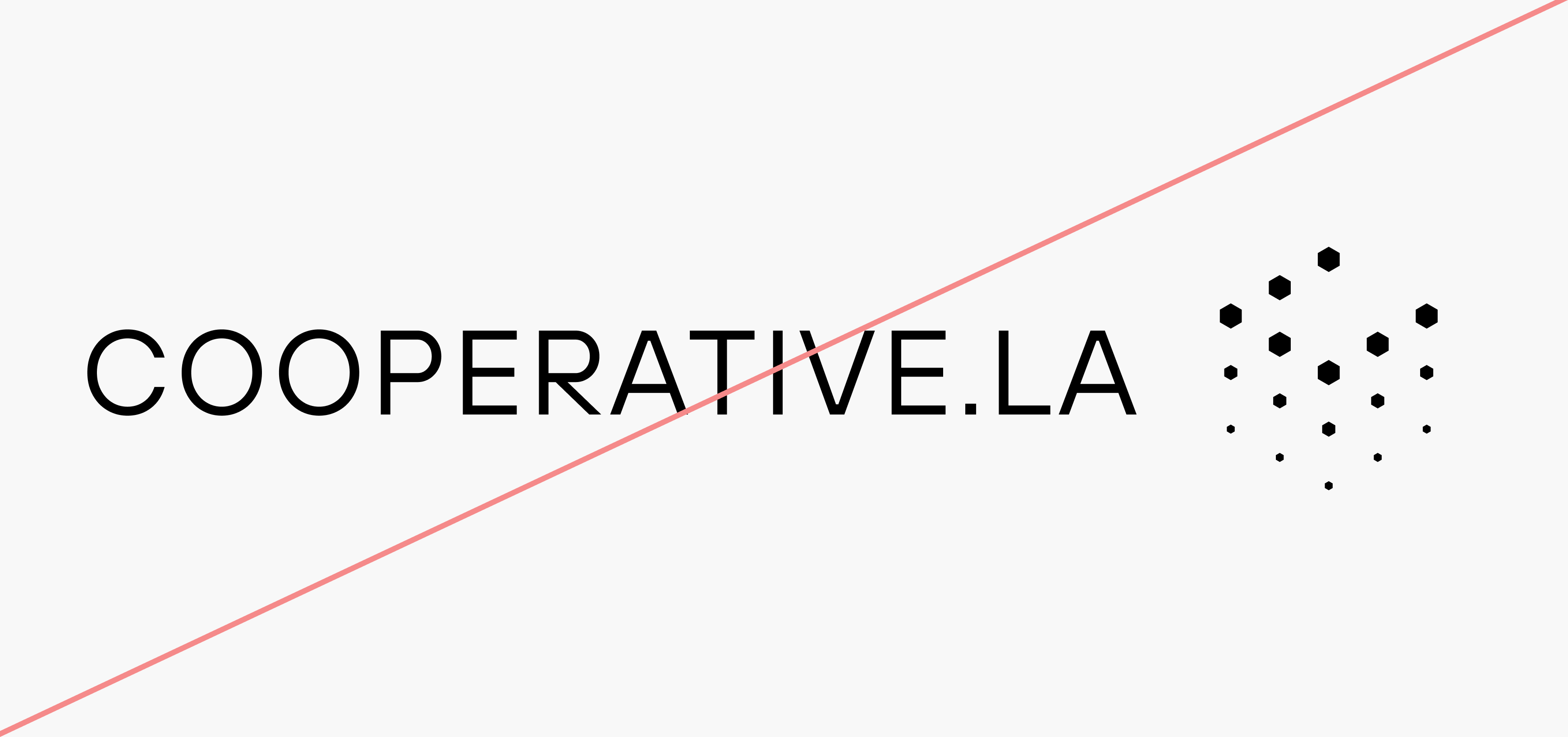
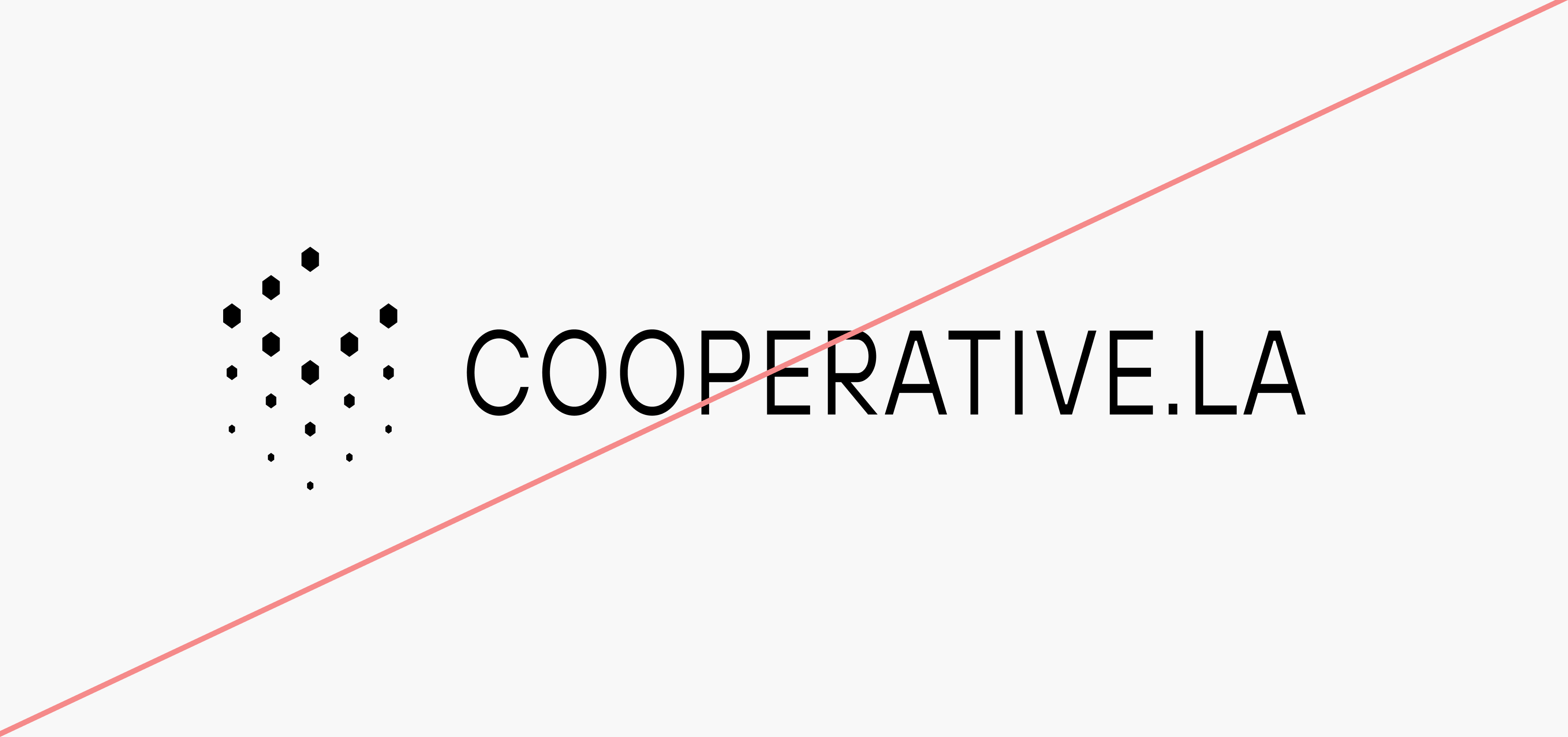
Logo
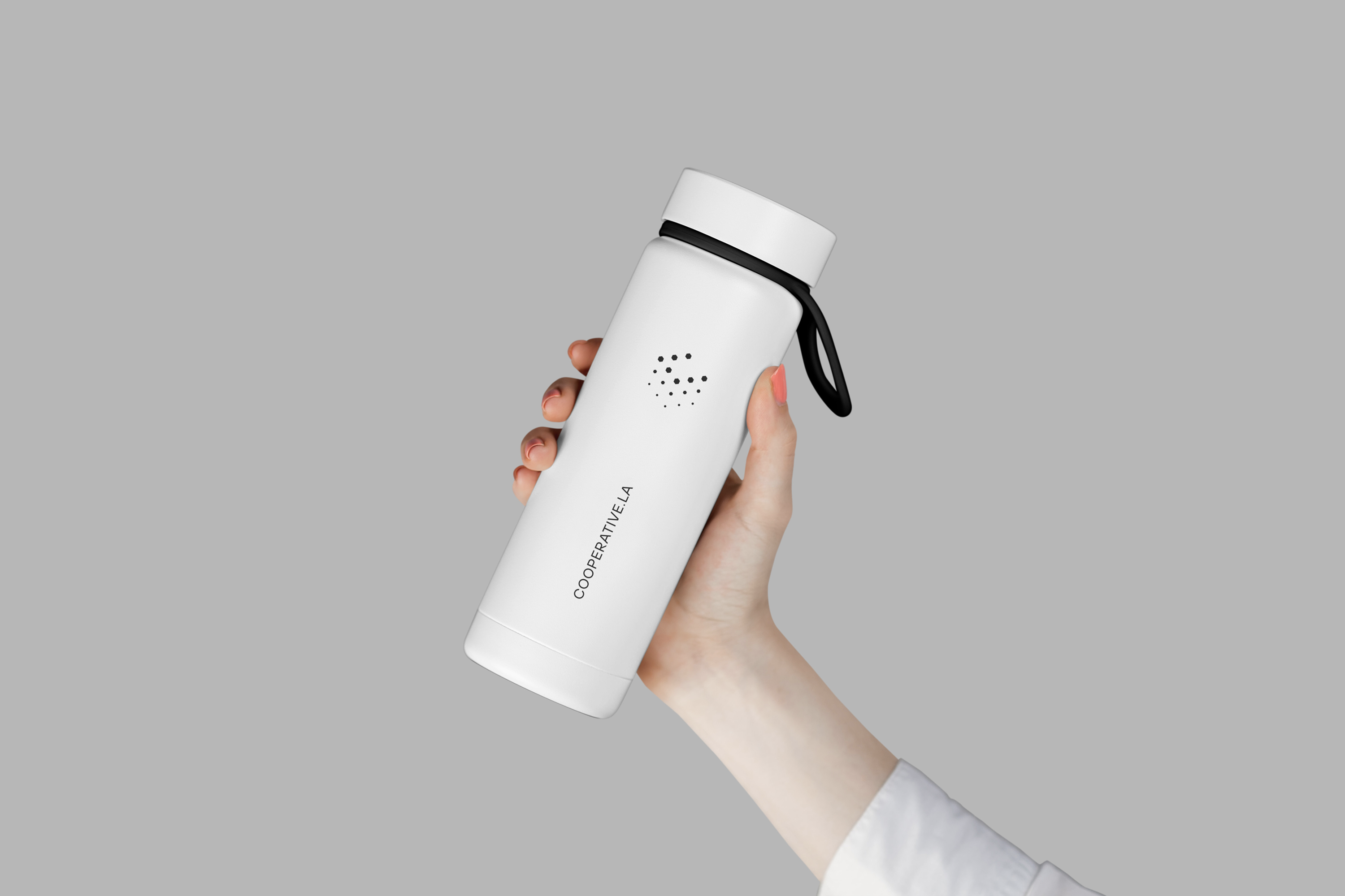
Our logo is formed from a minimal ‘C’ shape and represents how we bring everything together, solve complex problems and help our clients take their project from initial plan to built reality.
It has animated versions which are inspired by rubik’s cube and represents problem solving and finding the final form.
The upward movement creates a sense of momentum while the neatly arranged cubes represent organisation and efficiency. It’s a fitting symbol for how we make the complex simple, in a visual form.
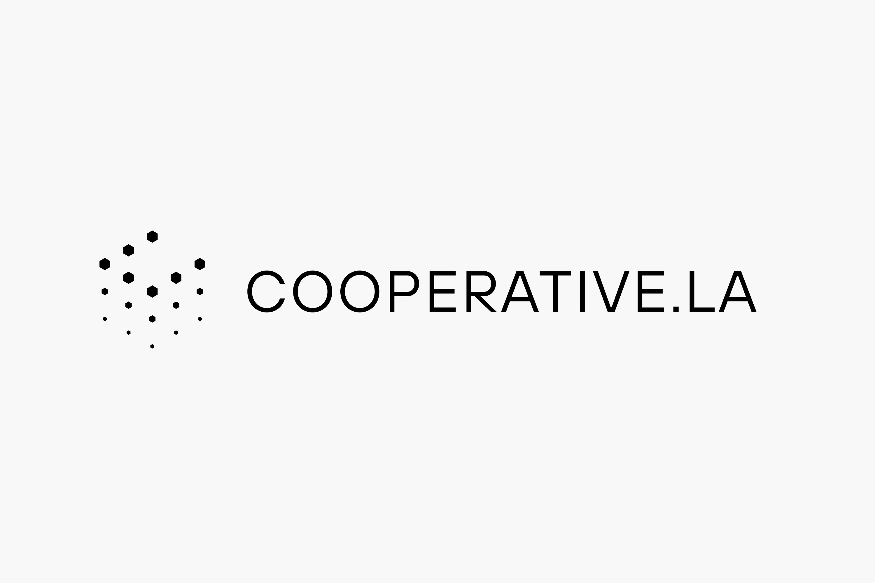
Logo

Logotype
Clearspace
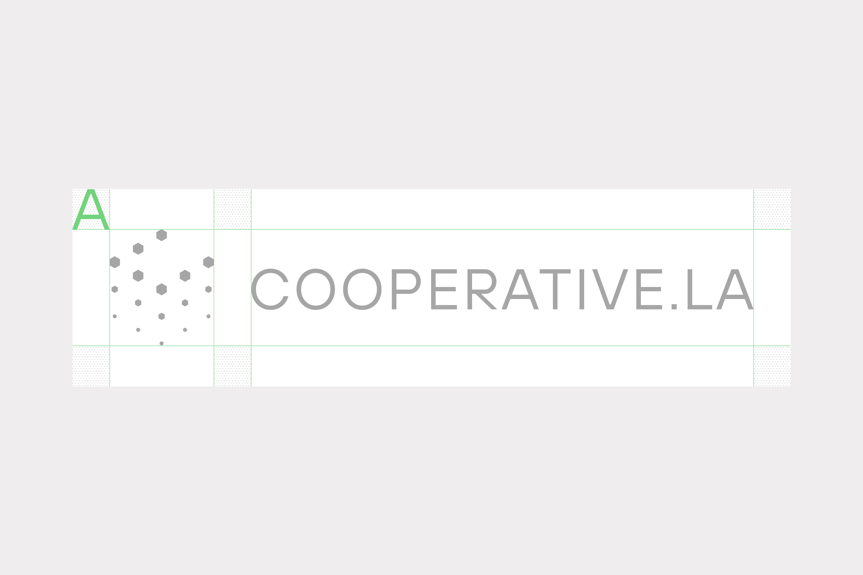
Lockup
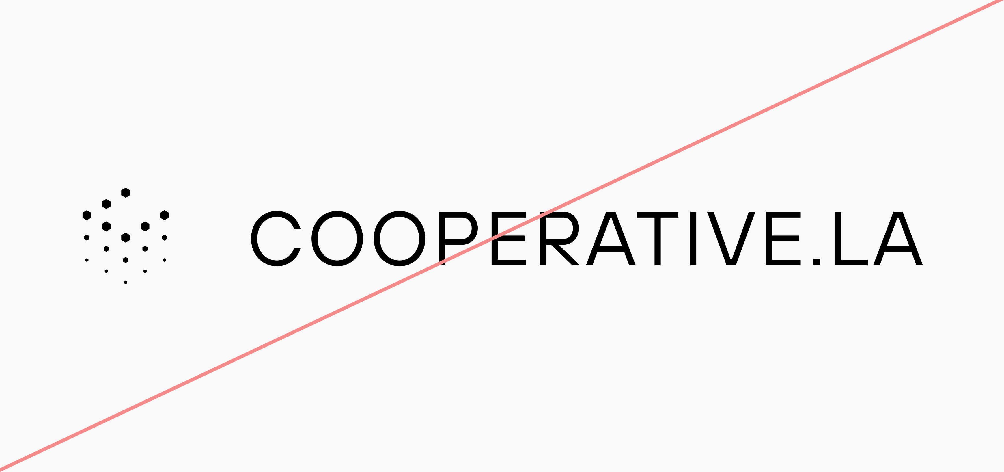
Incorrect Usage

Do not resize the mark
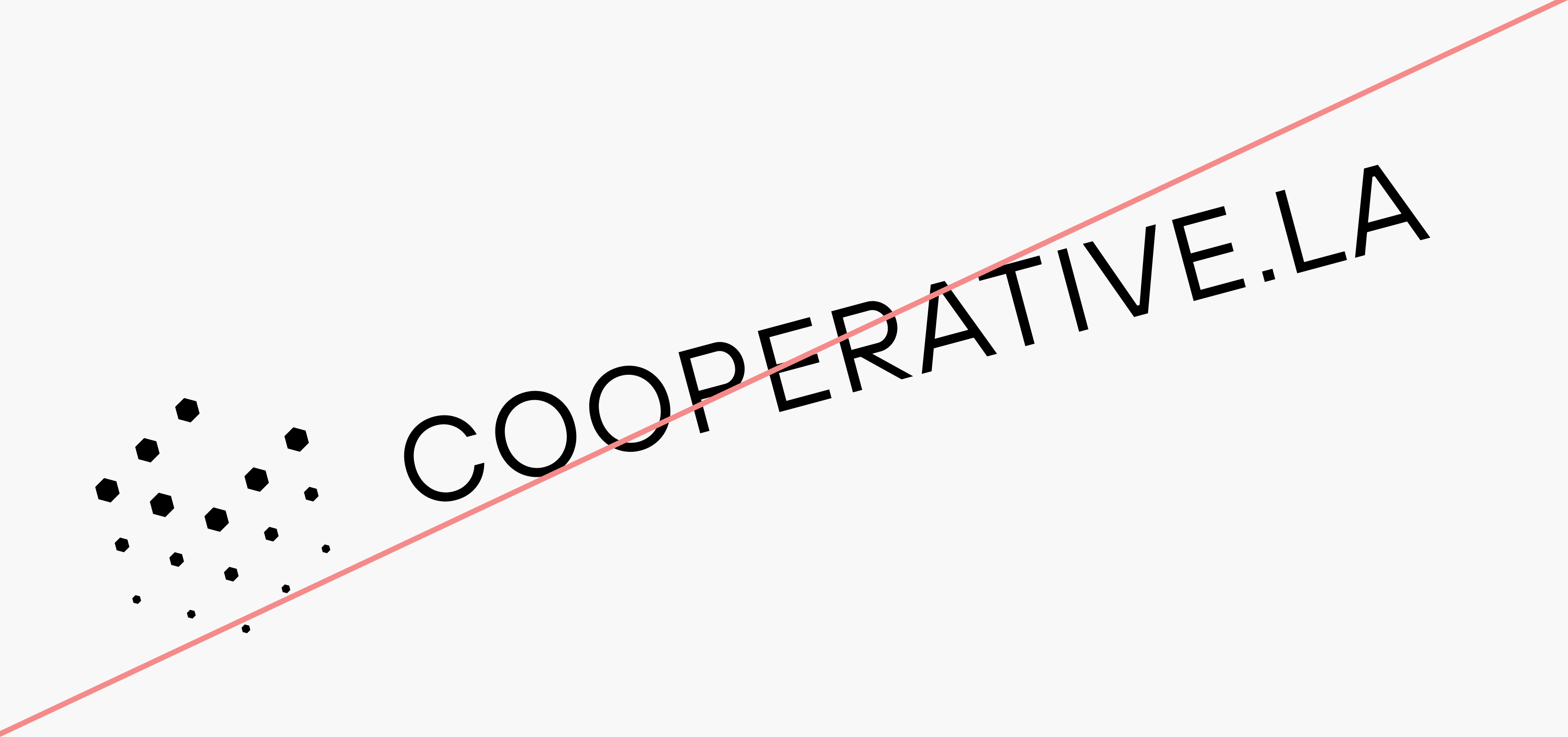

Do not angle the logo
Do not centre the lockup
Do not re-arrange the lockup
Do not stretch or distort the logo
Do not respace the logotype
06
Layout
When creating layouts, the logo and logotype can be seperated and placed in the top right and bottom left corners. The logotype can also be centred.
Margins should always be tight, which takes care but creates an impression of precision.
Preferred logo positioning
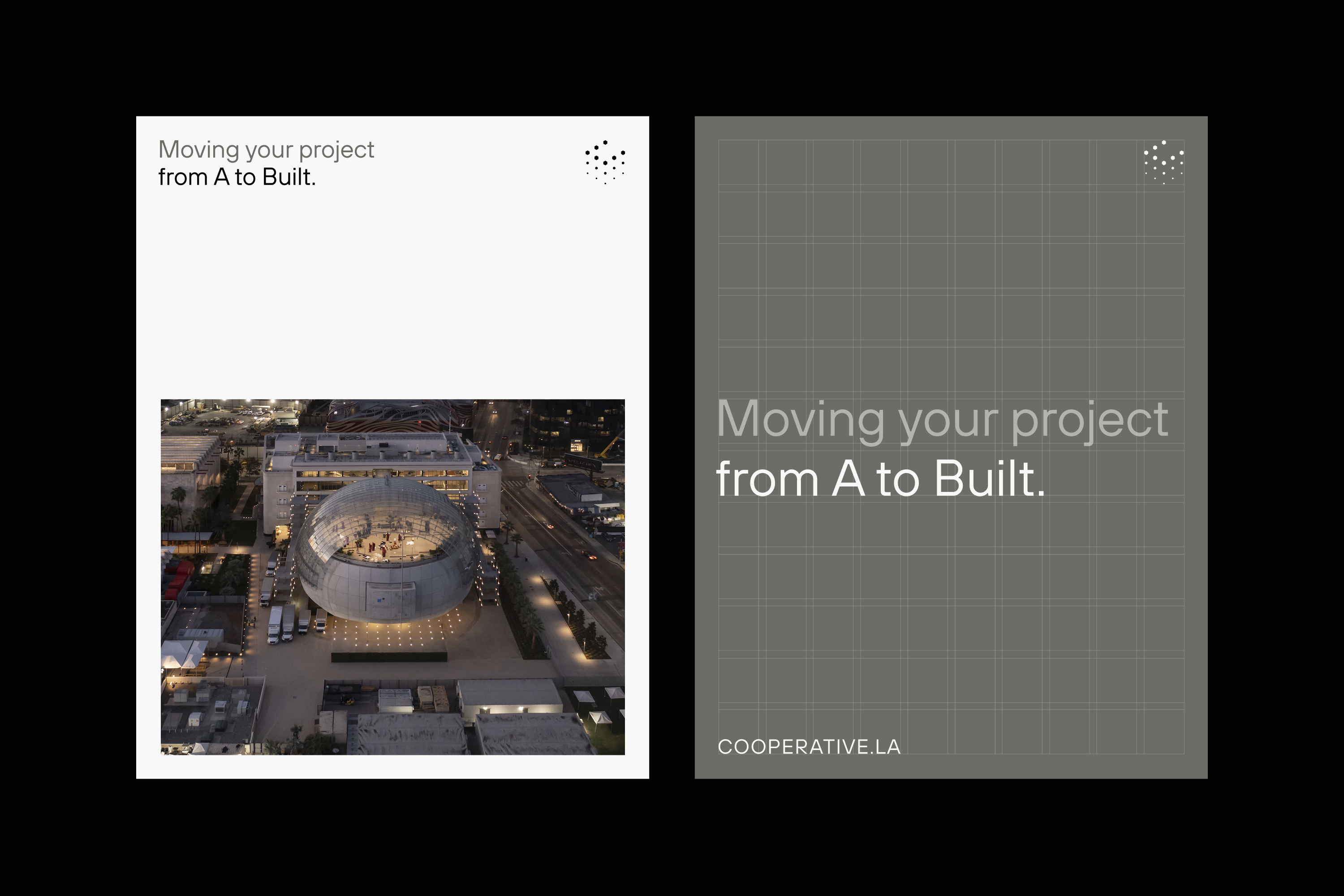
Layout example
07
Color
Our color palette is designed to evoke trust, reliability, and clarity, ensuring that every touchpoint reflects our commitment to accuracy and efficiency.
The secondary palette should be used sparingly and mainly in digital interaction, to highlight or denote categories and as color coding.
Primary Palette
Real Black
Hex: #000000
Steel Grey
Hex: #6E6C67
Cool Grey
Hex: #EFEDEE
Plaster White
Hex: #F8F8F8
Secondary Palette
Blueprint Blue
Hex: #9DDBEA
Safety Orange
Hex: #FFBF7C
Go Green
Hex: #72D37C
Important Purple
Hex: #D0AAD3
08
Graphics
Grids represent organisation, structure and infinite potential. These grid patterns can be used when we want a subtle brand presence or background. But they should not be used just for the sake of decoration.
Isometric grid patterns with cube

Dot grid light

Dot grid dark
Isometric grid patterns with line

Line grid light

Line grid dark
09
Typography
Cooperative LA’s typography is deliberately minimal. The aim in our communications is to create a sense of clarity and precision to evoke trust.
Our primary typeface is TT Hoves Pro. It’s a Scandinavian sans serif that balances neutrality with character. It combines utility, style, and aesthetic refinement for diverse applications.
When there are licensing or compatability issues, Instrument Sans can be used as an alternative.
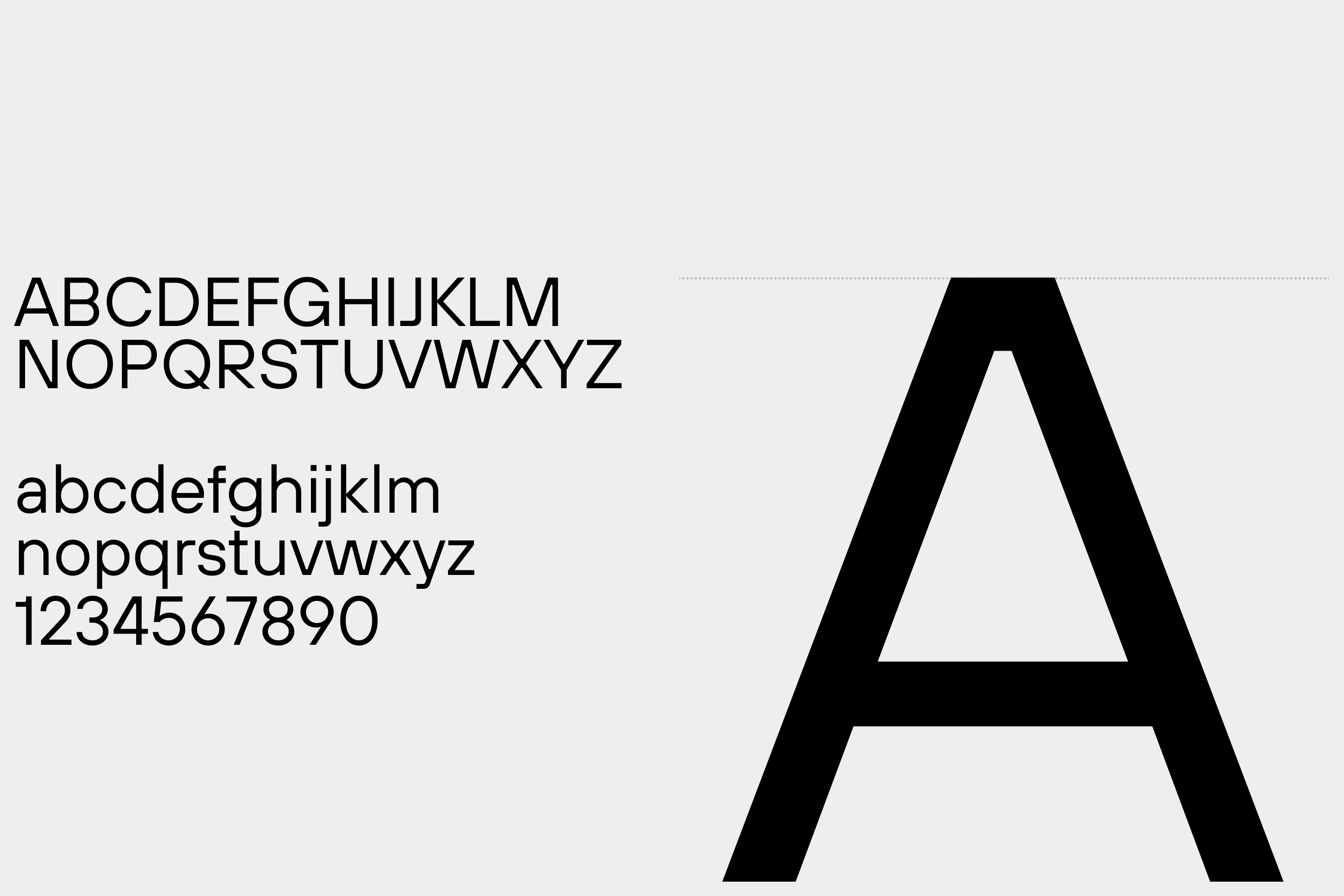
Primary Typeface
TT Hoves Pro
Secondary Typeface
Instrument Sans
Sizing
In general the aim is to use as few different sizes of text as possible, while allowing for large headlines and leading copy. Don’t avoid using large, bold statements — but look to pair this with minimal paragraphs or sections that add context and quiet confidence.
Cooperative LA is a new kind of owner’s representation and construction management company. Because we are led by former general contractors, architects, and developers, we know how to drive your project forward with strategic precision. Combined with our 40+ years of built experience, we are raising the level of excellence on the job and in our industry.
Type Sizes 0–24pt/px
130% Leading
0% Tracking
Cooperative LA is a new kind of owner’s representation and construction management company. Because we are led by former general contractors, architects, and developers, we know how to drive your project forward with strategic precision. Combined with our 40+ years of built experience, we are raising the level of excellence on the job and in our industry.
Type Sizes 24–55pt/px
120% Leading
-1% Tracking
Prioritizing success over ego to ensure every decision benefits the project
Type Sizes 55–72pt/px
110% Leading
-2% Tracking
Clear Up Confusion, Gain Peace of Mind
Type Sizes > 72pt/px
100% Leading
-2% Tracking
10
Examples
These examples, along with our website, show the brand identity in action and can be used a starting point for creating communications. Aim for consistency and clarity above creativity.